There are two places I designed for the Halodoc medical app. where the user is supposed to wait for the other party (in this case the doctor) to respond. Hence there is a need for an engaging animation that helps the user to wait little longer than the average patience.
To begin with the critical aspect was to play with the perception of fast moving time. After some brainstorming with the product team we arrived at the following CHECKPOINTS for the animation to be designed.
Checkpoints
Elements
- Loader (for indicating progress, Indeterministic)
- Messaging
- A way to cancel
- Icon/Animation (as required)
Emotions the elements should invoke in users
- Stress of waiting is reduced (play with the perception of passing time)
- Halodoc brand identity: Friendly, Helpful & Reliable
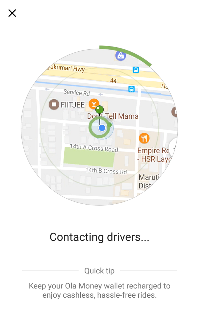
…and this was the flow diagram (with the animation placeholders in place). One close reference we studied was OLA’s wait animation while waiting for the driver

Some explorations and brainstorming

Use of HEIDI (the brand mascot) for the animation
Since a lot of work has already been done on the character by the third-party branding agency it made a lot of sense to use the same for the wait animation as well.
Following were the final animations arrived at after 3 or 4 iterations.


